Effective time management increases productivity and lowers stress.
Tempo is a time management application that focuses on daily tasks for short term progress, and makes repeat events or continual planning for the realization of long term goals. My role in this project was as UX Researcher from concept through completion.

Screens from Tempo.
Team
Andrea Gutierrez - UX Researcher & Designer
Bowie Lin - UX Researcher & Designer
Jiawei Wu - UX Researcher & Designer
Ambuj Tiwari - UX Researcher & Designer
― Overview
Effective time management increases productivity and lowers stress. Tempo is a time management application that focuses on daily tasks for short term progress, and makes repeat events or continual planning for the realization of long term goals.
The development of this application involved research methods including competitive analysis, surveys, user interviews, personas, affinity diagrams, journey maps, prototypes, and usability tests.
To receive the valuable benefits of time management, a user must first be engaged with their schedules. Our research recommends opportunities to maximize on delighters in the time management process, such as ease of use, the feeling of accomplishment, and more available time to incorporate tasks related to long term goals that may otherwise be sidelined due to the strain of a busy schedule.
― Initial Concepting
The initial concept for this product derived from two separate ideas that were merged together to become one. The first was a vision for a habit tracking application that would help the user accomplish their long term goals, the second was a complementary idea to improve the experience of smart calendars to maximize time management and efficiency. Together these two ideas formed what has now developed into the smartphone application, Tempo. The name Tempo is a play on both the Latin word for time, tempor, and the word template because of the scheduling templates unique to our app’s ‘Explore’ feature.
The intention was to create a product that would incorporate smart features that could expedite the process of entering events into your calendar, and forecast daily allotted times to work on repeated tasks that would culminate on a predetermined date. We also wanted the product to suggest intervals of time to you based on availability in your schedule, as well anticipate due dates. The calendar would be able to accomplish this work through the use of machine learning.
During the initial concept we were also mindful of the user’s motivation to accomplish tasks outside of their obligations, tasks which they might be motivated to do out of interest or ambition. To address this need we developed a concept in which the user could customize their experience through thematic calendar features, including: fitness, language learning, sleep, cooking, or cultivation of a variety of other skills. Ideally, the tasks on these calendars would be predetermined for the user, saving them the burden of having to schedule yet another thing.
Ultimately, we wanted to create a product that the user would adopt as a routine. To maximize user experience we focused on opportunities that would not only address pain points in current scheduling options, but also create a resource that users would enjoy using. We speculated that the best way to accomplish this goal was to shift the focus from traditional scheduling to an experience that does some of the more tedious parts for you so that you are free to focus on your work with a greater sense of accomplishment.
Feature concepts for Tempo.
― Audience
We focused our attention on students aspiring toward a more efficient time management style. This user group was suitable to our product for a couple of reasons:
1. Their need to maintain an organized and efficient schedule with several moving parts,
2. Their assumed tech literacy, and
3. Our access to this user group for research.
― Competitive Evaluation
We were fortunate to have many competitors to evaluate. We used their strengths to gauge the necessities of a time management product, and we considered their shortcomings an opportunity for growth. We evaluated some of the top competitors in digital scheduling; including, Google Calendar, Apple Calendar, and Microsoft Office 365. We also evaluated some lesser known competition; such as, Strides, Monday, CloudCal, and Habitbull. In total we evaluated 14 competitors.

Strengths
The strengths that we identified in our competitors are:
Integration- being able to integrate calendars into other products across platforms
Customization- customizing your calendar to suit individual needs
Multiple Calendars- maintaining more than one calendar in the same product to satisfy different scheduling needs
Natural Language Input- scheduling according to speech recognition and a natural language understanding.
Opportunities
One area in which we felt we had some opportunity for growth involved the effort that it takes to maintain a schedule within these products, which is often high and results in user fatigue. We also identified an opportunity to create a cleaner interface. Often the more product features a scheduler contained, the more crowded their interface. Perhaps the biggest opportunity that we identified is that none of the products that we surveyed were particularly engaging for users. We hypothesized that users resorted to these schedules by obligation, or because they were instituted by their affiliated organizations, but not because they were fond of using them.
― User Interviews
We interviewed 12 users in total. 5 participants between the ages of 25-34 and 7 participants between the ages of 18-24. We interviewed 5 self-identified women and 7 self-identified men. All of our participants had previous experience using calendar products.
The interviews were completed in person, averaging 40 minutes each. Participants were recruited through convenience sampling. We divided our roles as interviewer and note-taker, and also audio recorded all sessions based upon user consent so that other teammates who were unable to join would have a chance to listen to the session, and so that we could review them if we had any questions.
The interview script is comprised of five sections: Demographic, Technology (Technology Touchpoints, Technology experiences (Other Apps, Relevant Apps)), Experiences and Attitudes, Goals, and Wrap-Up.
― Survey
In addition to conducting in-person interviews, we decided to conduct a survey in order to be able to generalize and validate our responses and hypotheses about time and goal management from our interviews. We modified the questions from the interviews and created a survey using Qualtrics, which was sent out to the Insider, a mailing list maintained by the Student Association for the School of Information (SASI), at the University of Texas at Austin School of Information. This sample was representative of our target users because the school primarily consists of graduate students who are young adults with average to high tech-literacy, while also including faculty, staff, and alumni at the school.
We received a total of 42 complete responses, with 33 respondents within the age range 18-34 and a large majority of them being students.
We first asked respondents to rate their level of agreement to a set of statements related to general attitudes and behaviors towards scheduling and time management. Some key findings from this task were:
A large majority of people use a schedule to manage their time and to plan personal tasks.
People are mixed on how enjoyable the experience of managing their schedules is.
People do not feel a strong need or desire to share their schedules with others.
People generally do not feel like they have enough time to accomplish all the things they want to do.
Most people believe that time management factors highly into their realization of their goals.

A screenshot of responses from our Qualtrics survey.
We also wanted to gauge how people mentally envision their time and how far in advance they tend to plan their future. Several of our interview respondents indicated that they usually plan their tasks for the next day. We asked respondents to rate how often they planned something in advance at various intervals of time and found a few interesting takeaways:
People don’t actually plan something a day in advance as much as expected.
People mostly plan things a week or two weeks in advance.
Beyond one month, people plan things less and less with increasing lead time.

A screenshot of responses from our Qualtrics survey.
Next, we asked about usage of various products, from device to apps. Our findings on usage can be summarized below:
More people use smartphones than any other devices and they use them with higher frequency as well.
Laptops are the next most widely used device.
Most people never use a smartwatch or smartspeaker.
Almost as many people use desktop apps as mobile apps to manage their time (this includes overlap).
Only 13 people said that they do not use any physical tools to manage their time.
Only two people indicated they do not use any tools to manage and track their time.
People overwhelmingly use Google Calendars as their calendar app.
In order to help us prioritize our design goals and features, we also asked participants what characteristics they liked about the apps they selected and how much they would like certain features in a calendar or time management app.
Simplicity/Ease of use was the most widely selected characteristic with Cross-platform Integration and Organization following.
Time Alerts and Customization were the most desired features in a calendar or time management with Search Function and Task Prioritization following.
Overall, people generally liked natural language input, templates, and sharing.
Social recommendations and social/group/peer accountability appeared to be disliked features.
People were pretty indifferent to the remaining features.

A screenshot from our Qualtrics survey.
Based on our survey results, we were able to draw a few important conclusions that shaped our design approach and process.
First, most people maintain a schedule to track their time but it’s not necessarily an enjoyable experience so there is room for improvement. Time management is almost an inevitable part of daily life in the U.S. and nearly everyone uses a schedule to manage and plan their time. With such a necessary and widespread activity, these responses validated our mission and motivation to improve the time management experience. People also generally plan a week or two ahead so we needed to focus our solution on this time frame. We hypothesized this time frame is preferred because it is between a short-term and long-term view; i.e. people like to know what they are doing for the next few days but not as much beyond that. That being said, this signaled to us that we needed to bridge the gap between these different types of planning (short-term and long-term) and provide a single solution for people to track all of their goals, short and long.
In terms of delivery platform, we decided our solution should be a smartphone product based on device and app usage. However, people seemed to use a combination of paper and digital tools so our product should incorporate some features or at least characteristics of physical tools. Google Calendars is also widely used and preferred so we could use it as a reference for good calendar app design and user experience and look for ways to improve and add to it .
The survey also allowed us to identify which characteristics and features we needed to focus on. Simplicity/ease of use stood out immediately as the most appreciated characteristic and we needed to prioritize that the most. On the other hand, some of the other features that we were considering and thought people might like, such as natural language input and social accountability, were actually not as strongly liked and were even disliked in some cases.
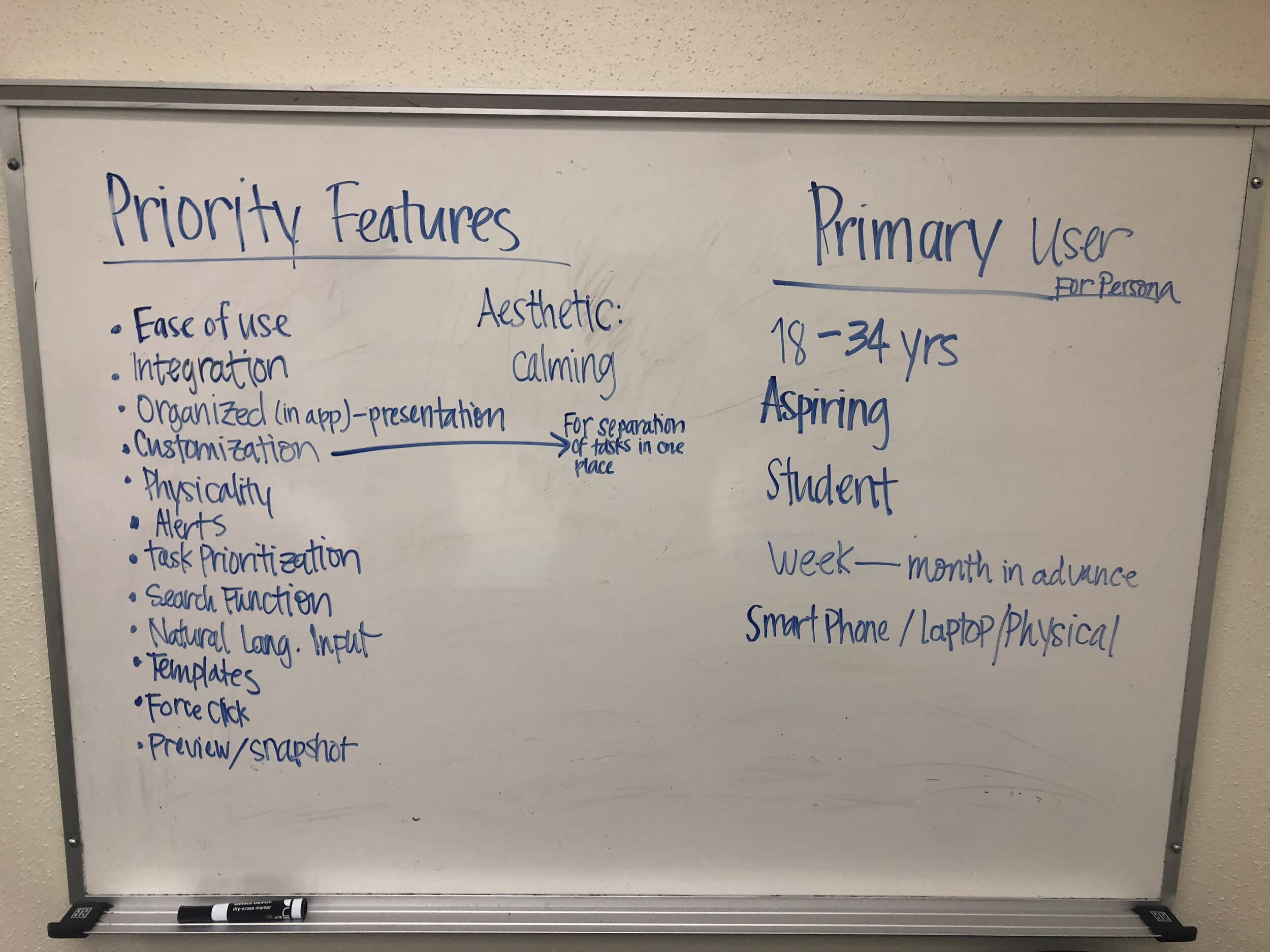
Combining these survey responses with our interview findings, we were able to draw up this prioritized ranking of design features that we should focus on.

― User Persona

A persona represents a cluster of users who exhibit similar patterns in their behaviors, attitudes and motivations. It’s a great way to help develop solutions, products, and services. We built our persona based upon what we got from the user interviews and surveys.
― Affinity Diagram
We then used an Affinity Diagram to organize our findings into natural relationships represented by their relative distances and positions. We transformed our interview takeaways into work activity notes, and grouped them by similar topics. To do this exercise we used the online collaborative tool, Mural.
We determined three main phases to use as a guideline to group our main findings:
Motivation (Before Action)
Planning (During Action)
Reflection (After Action)
Below each of these phases, we also further defined subcategories of types of feedback and topics, such as Likes/Dislikes, Goals, Success/Failure, etc. These subcategories are represented by the orange sticky notes in the middle of each cluster.

Affinity diagram done in Mural.
Below are some of the observations we made from the Affinity Diagram:
Motivation (Before action):
There are two different kinds of motivations when people make a schedule: active stimulator and passive stimulator.
There are three kinds of time management styles: free style, aspiring style, and organized style.
Most users check in with their schedule on a daily basis.
There are mainly two kinds of behavior patterns when making a schedule:
a. Time linear: Plan for the next period of time in advance.
b. Time/Event occurrence: Only make schedule when there is an event that is going to happen.
Most users only keep long-term goal in mind, but they do believe time organization is helpful for the realization of long-term goals.
Planning (During Action):
Users care about the cross-platform function of the calendar(integration).
Sometimes, users utilize physical calendars, whiteboards, sticky notes, and other tools to help manage time.
Reflection (After Action):
We summarized participants’ commonalities and differences of sharing, enjoying, success factors and failure factors after they executed tasks and events.
a. Sharing should be a highly optional setting. Since some participants are eager for this function so that they could share their calendar with their family and friends; Others believe calendar is private and don’t want to share it with anyone.
b. Participants enjoy the feeling of completing tasks, for example, the satisfaction of crossing off tasks in the calendar.

White board summary of affinity diagram.
― Journey Map
After our user interviews, we were able to surmise three important stages of the user journey:
Consider
Input (Execute)
Reflect
Input and execute are considered together because the execution of tasks takes place away from the schedule to varying levels of success. Whether the task is accomplished or not is often connected to whether or not it made it into the schedule in the first place.

― Paper Prototype
Before making digital screens, we made paper prototypes to test with users. This allowed us to begin thinking about layouts while giving us a simple and flexible platform to make changes.

― Low-Fidelity Prototype
After designing paper prototypes, we quickly moved to replicating those into digital screens. We used Figma for this. At first, we designed low-fidelity mockups since we wanted to capture any design issues while the design was still lo-fi, prototype these, test these with real users and then use those findings and takeaways to refine our design. We chose to have colors even in the lo-fi because we were dealing with different ‘layers’ in the calendar and in order to differentiate between the different layers and templates, it was important to convey that difference to the users.

― High Fidelity Prototype

― Implementation and Testing
We conducted a total of three rounds of testing, with each round giving us equally valuable insights. We first tested the paper prototypes with real users. We then used insights from those to create our lo-med fi designs which we tested with real users as well. Based on takeaways from those, we further refined our lo-fi designs and ironed out the inconsistencies in our design and general task flows and eliminate any possible confusion. After all this, we had our final set of high fidelity mockups, prototyped them and tested them with 15 usertesting.com users via a remote testing mode.
Remote Testing
For our third round of user testing, we used the usertesting.com website to test our refined designs from the second round of testing. We tested our high fidelity mockups with 15 different participants.
Features people liked:
Store page and templates
High degree of customization
Less manual input or entry
Color coding
Automatic arrangement of tasks
Direct quotes from participants:
“Very good product, needs a few minor tweaks”
“Most approachable calendar app I have used”
“Like the color-coding, really enjoy that”
“Although there are multiple features, none of them are overly complicated.”
― Conclusion
When prompted to find an issue that could be improved by design, we identified several issues with time management, including; task prioritization, goal tracking, and accomplishment. Ultimately, they all boiled down to the same problem: a lack of time. Time is a common and impartial resource for all people, so we took on the significant task of finding some solutions that may help minimize that problem. Through our research we found plenty of room for improvement, and we believed that we could create a smarter calendar that would learn about the user and tailor to their behaviors and goals; for this, machine learning would be a compelling solution.
Along the way, we encountered some challenges. We had a lot of competitors and similar products that were already existing. While this was a plus for having many references to base our idea off of, it also posed a challenge in an effort to make our product different and better than other solutions. We discovered that rather than attempt to recreate the entire experience we could incorporate the features that were working well and add features unique to our product that would address user pain points with current systems. Our unique layered interface, task completion, and thematic templates we were able to accomplish this effort.
In our last round of testing a participant said, “This has got to be the best calendar I've ever seen because it thinks for you!” This user identified herself as a busy mom who could greatly benefit from the use of our product. While Tempo has room for improvement, we feel this is a positive testament to the scope and capability of our solution.